


Context
For over a decade, GSK had collected extensive field data from physicians, nurses, and patients—covering everything from side effects to prescribing patterns and why clinicians might choose competitor drugs over GSK’s. Yet despite amassing a goldmine of information, there was no meaningful way to analyze it.
The AIM Dashboard (Analytics and Insights for Medical) was created to change that. The vision: convert massive, fragmented datasets into actionable insights via an interactive dashboard. GSK hired a new role, the Medical Insights Analyst, to work with this tool and bring forward opportunities for innovation, research, and market advantage.
However, the initial implementation on Power BI quickly failed. It struggled with GSK's data scale, lacked flexible medical visualizations, and often took over 30 minutes to load. Analyst engagement was low, trust was broken, and most critically—no new insights were being generated in the first six months of use.
Role & Team
As the Senior Product Designer, I led the redesign effort, working closely with:
- A Product Owner
- The Director of Medical Insights (my manager)
- A small engineering team
- The newly hired Medical Insights Analysts
My responsibilities included:
- Conducting continuous user research through biweekly focus groups
- Designing the UI and overall user experience
- Leading usability testing via System Usability Scale (SUS)
- Advocating for and executing the platform migration from Power BI to Plotly
- Rebuilding user trust and engagement
Process
Initial SUS testing yielded a score of 34 out of 100—a clear signal that the dashboard was failing its users. While I iterated on the Power BI interface to mitigate pain points, usability improvements plateaued at a score of 51. It became clear that the platform itself was a blocker.
With the Product Owner, I spent 8–9 months advocating for a full rebuild using a custom tech stack centered on Plotly, which offered vastly improved data performance and flexibility.
Meanwhile, user morale was tanking. To address this, I worked with the PO and Director of Medical Insights to launch:
- A “You Said, We Listened” weekly email series, sharing small but real improvements based on user feedback
- Live demos during every biweekly focus group to prove we were listening and actively making changes
These efforts were instrumental in slowly rebuilding trust and re-engaging analysts.
Challenges
- Technical limitations: Power BI simply couldn’t handle the scale or complexity of the data.
- Stakeholder buy-in: A full rebuild required months of influence and executive support.
- User trust: Frustration was so deep that analysts often abandoned the dashboard entirely.
- Performance: Load times over 30 minutes were unacceptable and had to be brought down dramatically if we had any hope of launching a successful product.
Post-migration, we had a chance to use enhanced visualizations and a modern navigation that met users where they already were.
Solution
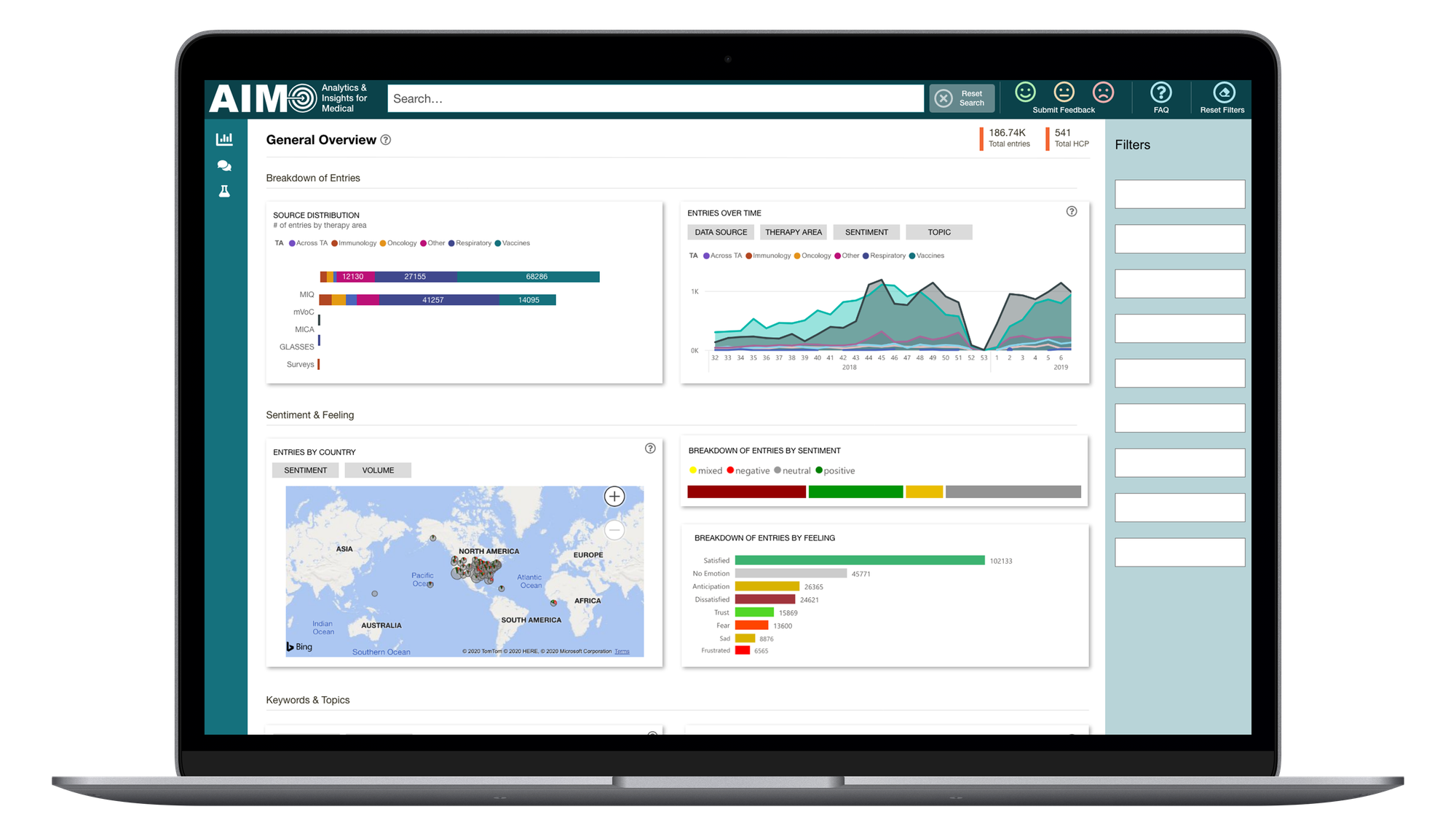
The redesigned dashboard, built on Plotly, delivered:
- Near-instant load times, down from over 30 minutes with Power BI
- Intuitive, low-friction navigation, based on real analyst workflows
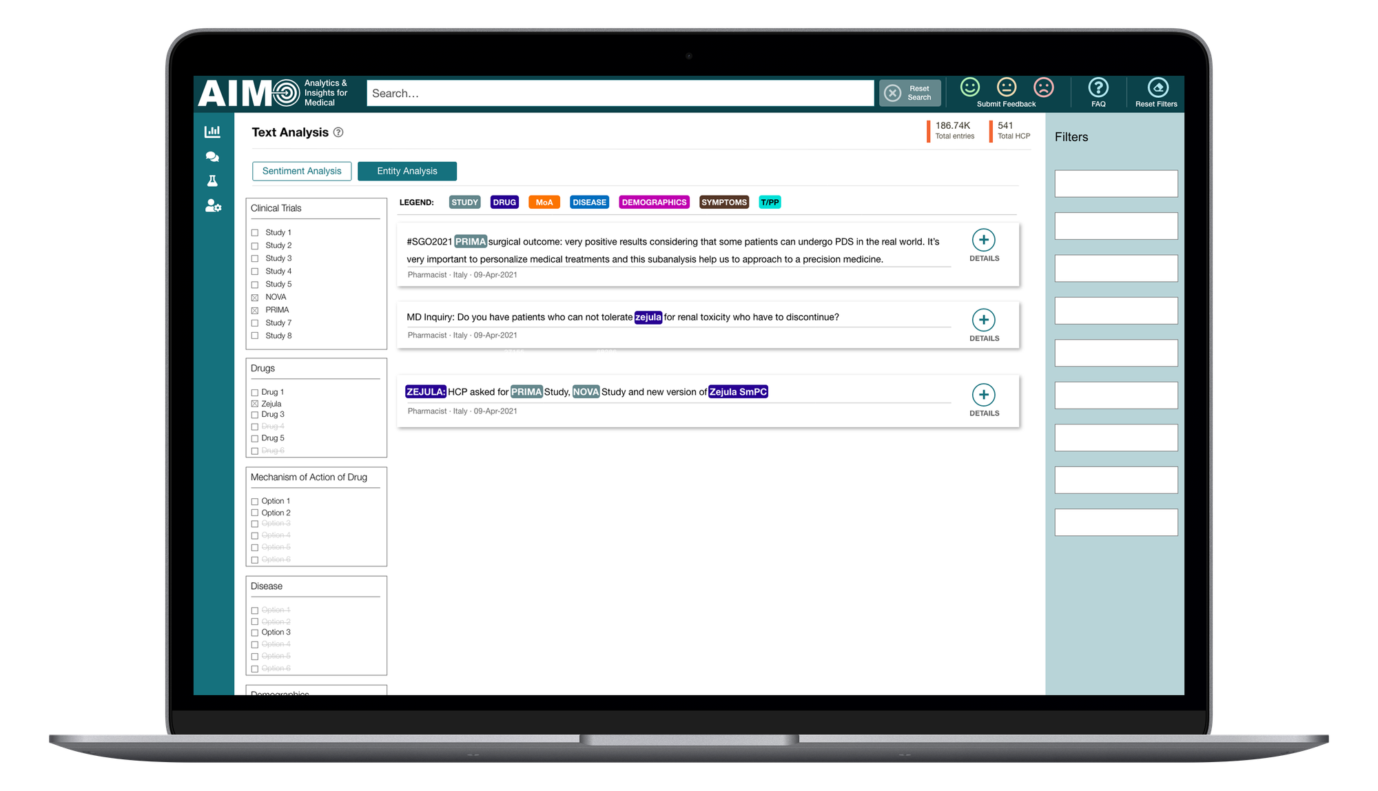
- Flexible and medically relevant visualizations
- A visual language grounded in the internal GSK design system for enterprise experiences, known as Teal.
This wasn’t just a redesign, it was a reintroduction. For many analysts, it was their first real opportunity to start extracting meaningful insights from years of underutilized data.
Results & Impact
- SUS score improved from 34 to 81 (well above industry average)
- Triple-digit increase in analyst engagement
- New insights were finally generated, driving value from long-dormant data
- User trust rebuilt, thanks to honest, consistent feedback loops
- Awarded the GSK Gold Award in May 2021—the company’s highest internal recognition
“Thank you for your relentless advocacy of a better way of doing business, even amid the significant challenges imposed on all of us who are trying to make big changes during a historic pandemic. Your leadership aligns with GSK's core values and empowers our company to keep driving its products forward.”
— GSK Gold Award Recognition Letter
Reflection
This project stretched me in every direction—technically, politically, and emotionally. It taught me that success doesn’t always feel like success. Despite measurable results and formal recognition, the day-to-day experience was frustrating and unsustainable.
The biggest lesson? Product design only works when it’s valued. At GSK, I often felt like I was fighting uphill to prove the worth of UX in a system that wasn’t ready for it.
That experience was a turning point. I transitioned into Design Operations roles because I wanted to create the conditions where designers could do their best work without having to fight the same battles I did. AIM was both my hardest role and my clearest catalyst for personal and professional change.
